C R E A T I V E D I R E C T I O N & A R T D I R E C T I O N
*
*
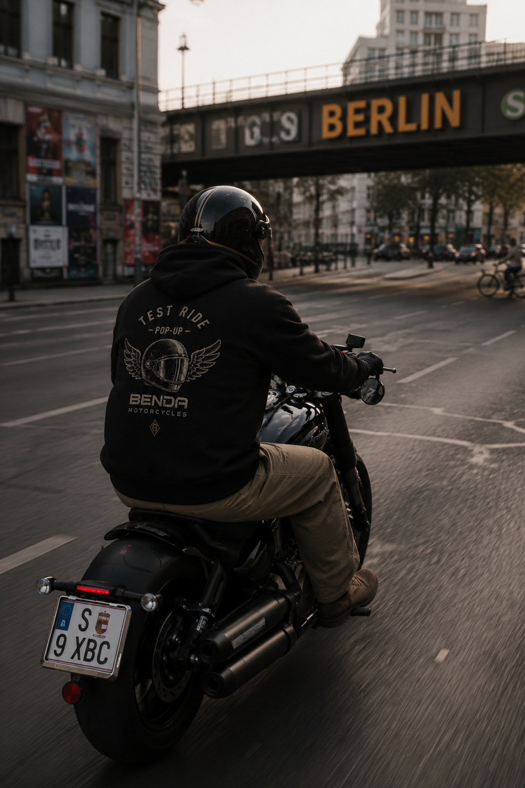
Reimagining how a motorcycle brand is experienced through identity, content and culture.
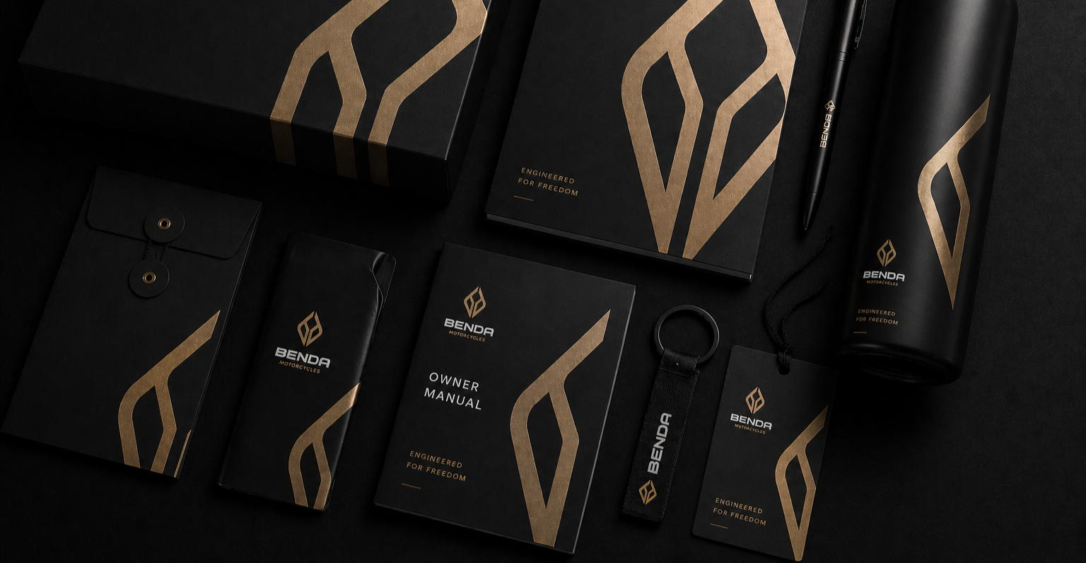
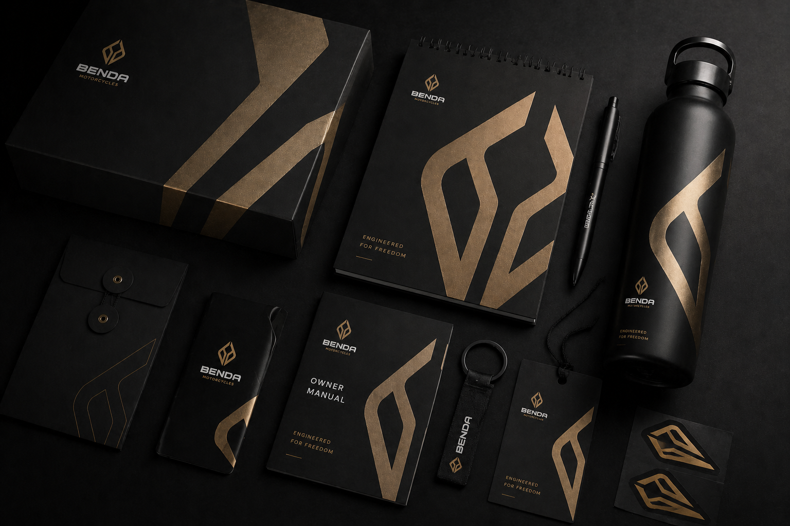
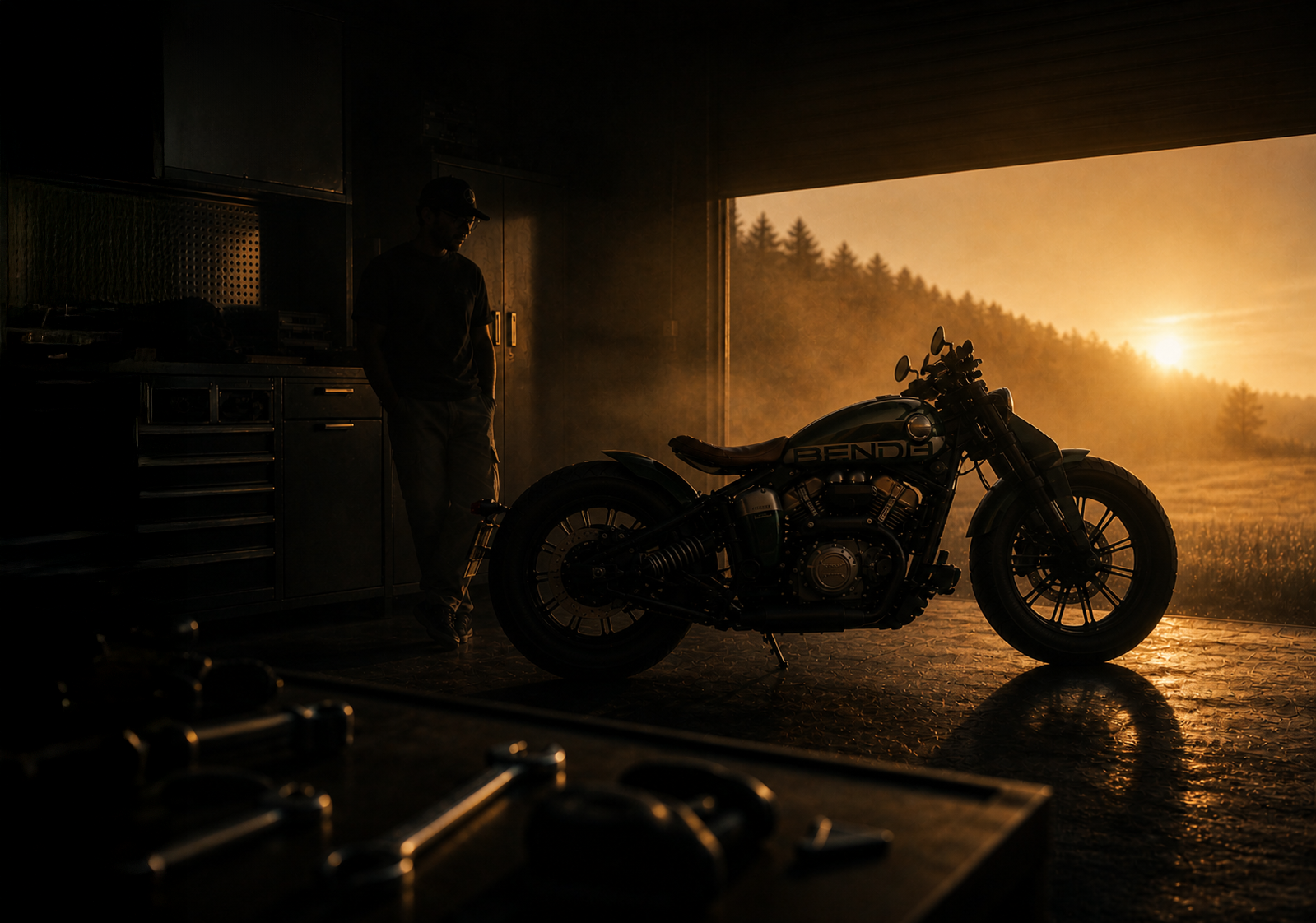
BENDA mOtO
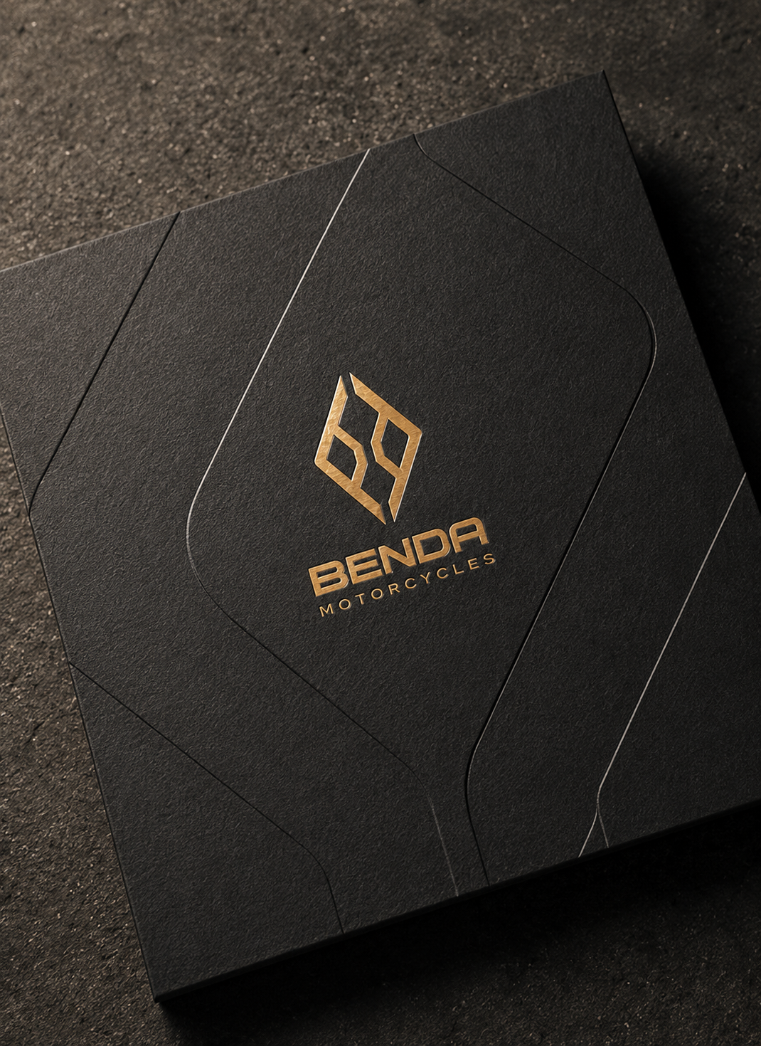
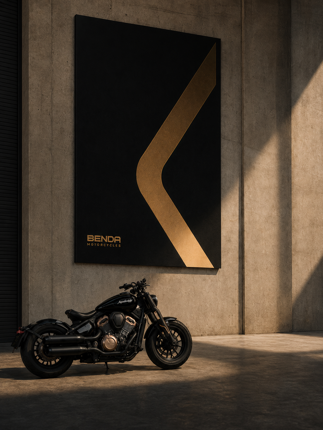
Benda Motorcycles
Art Direction — Brand & Communication
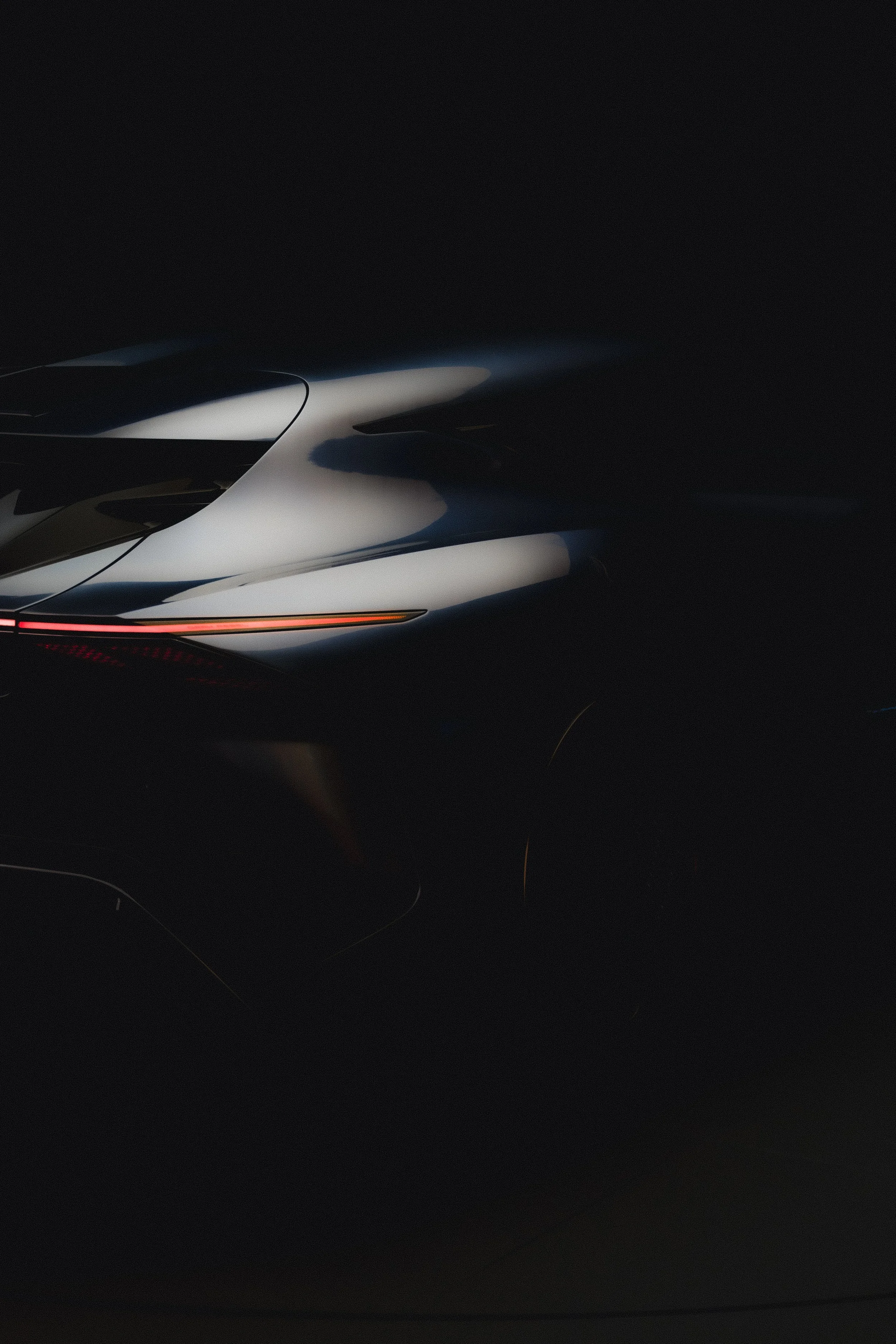
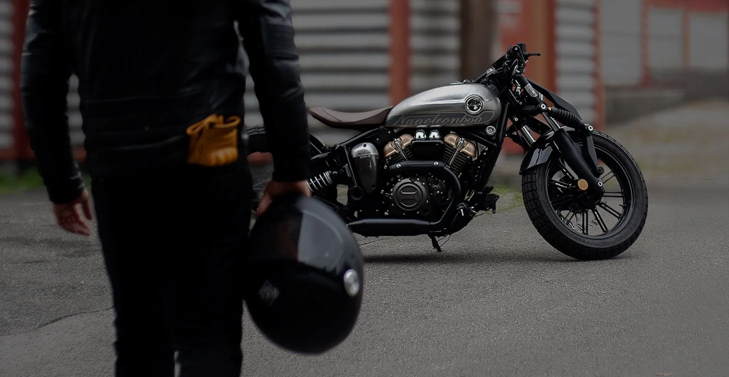
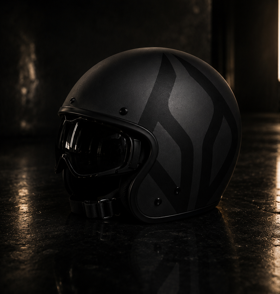
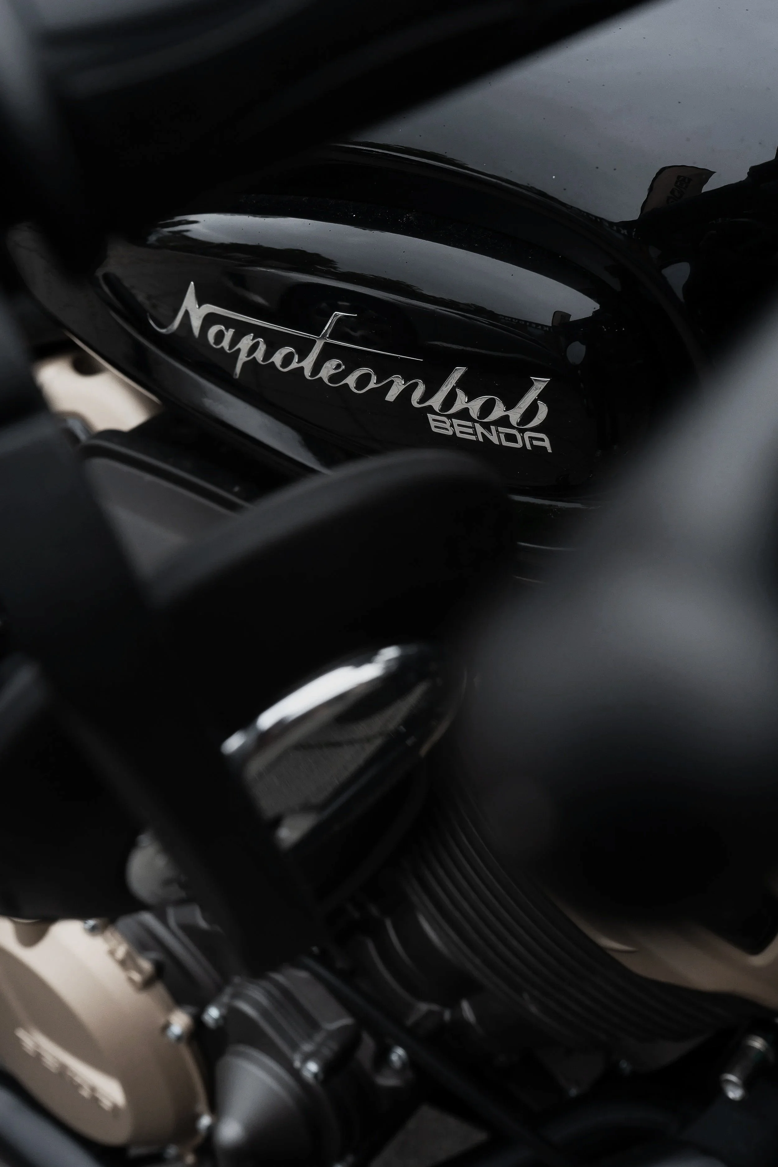
N A P O L E O N B O B 2 5 0
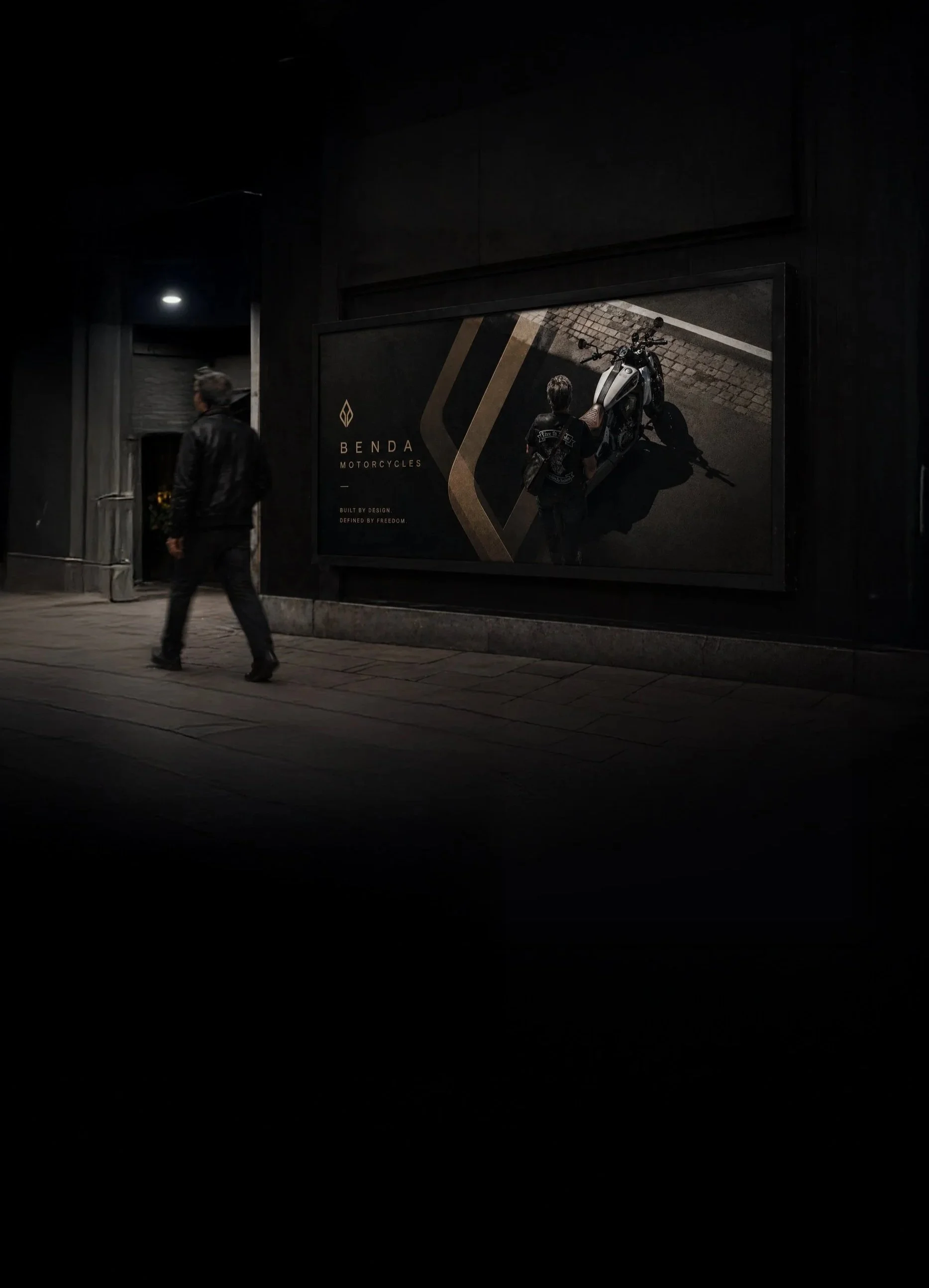
B E N D A M O T O R C Y C L E S
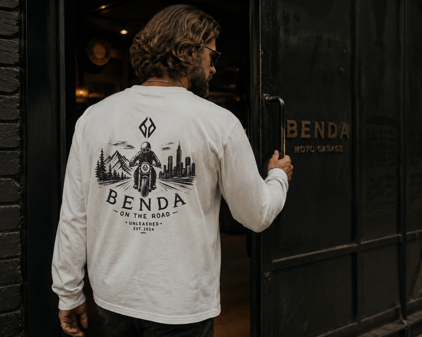
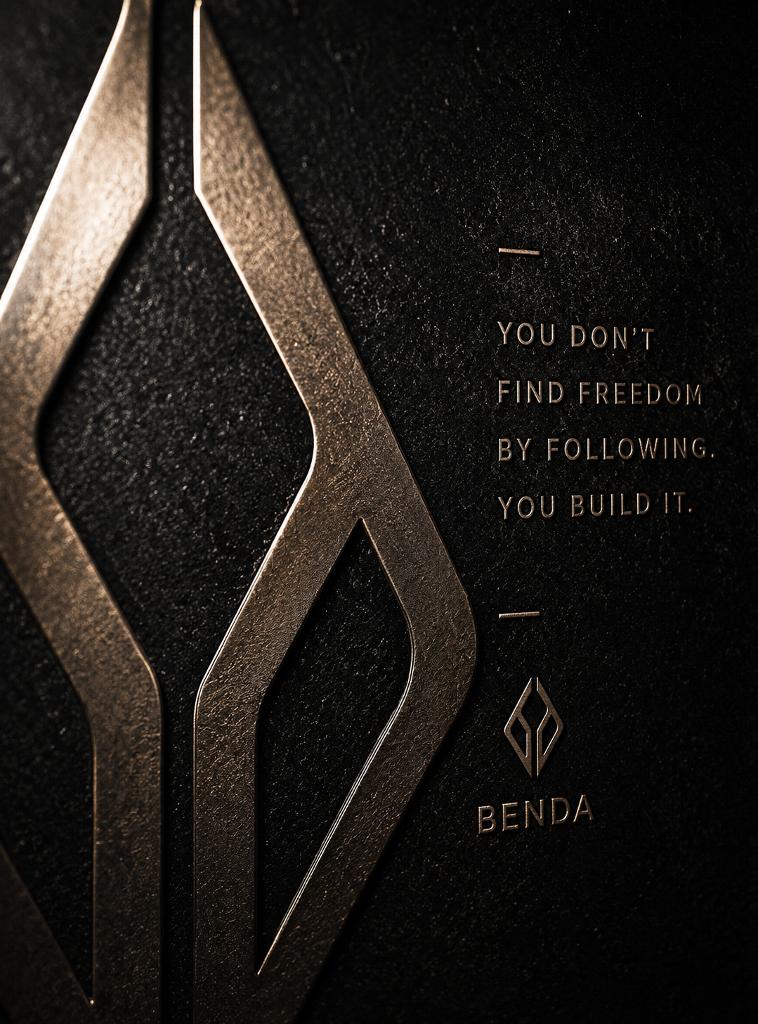
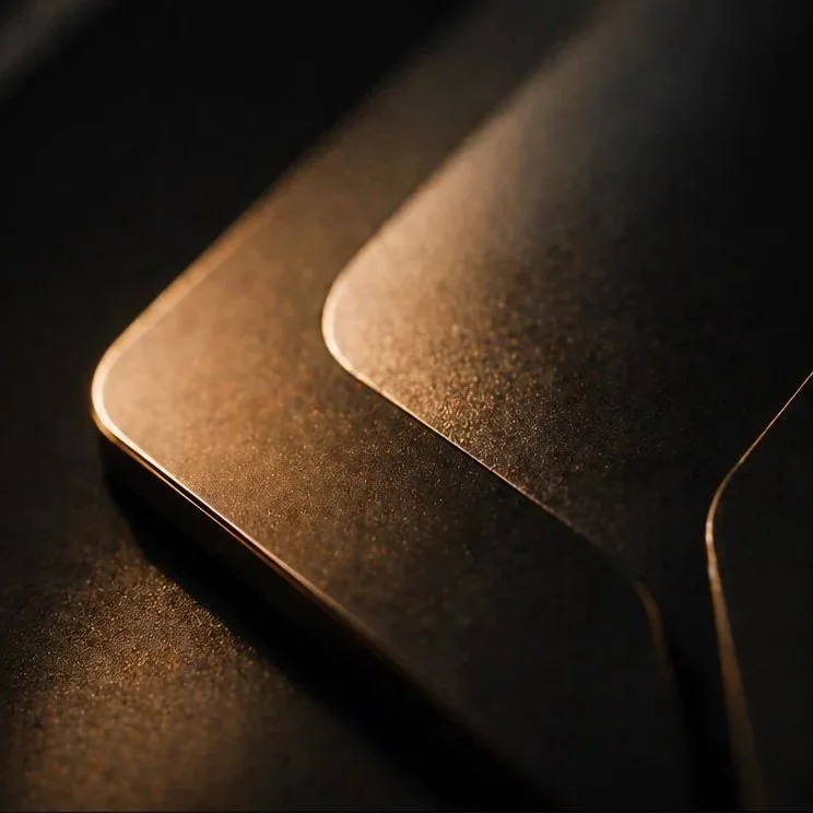
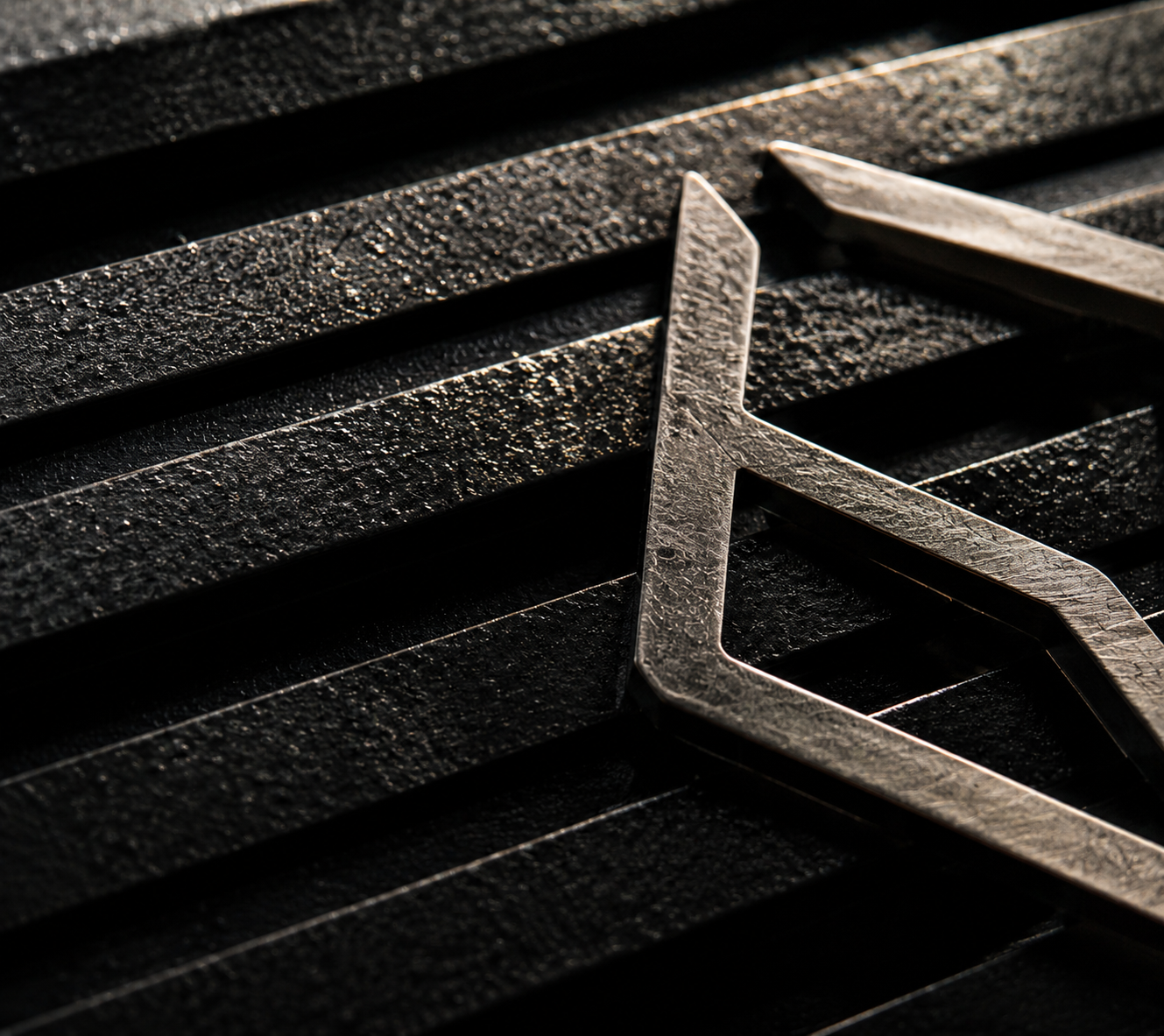
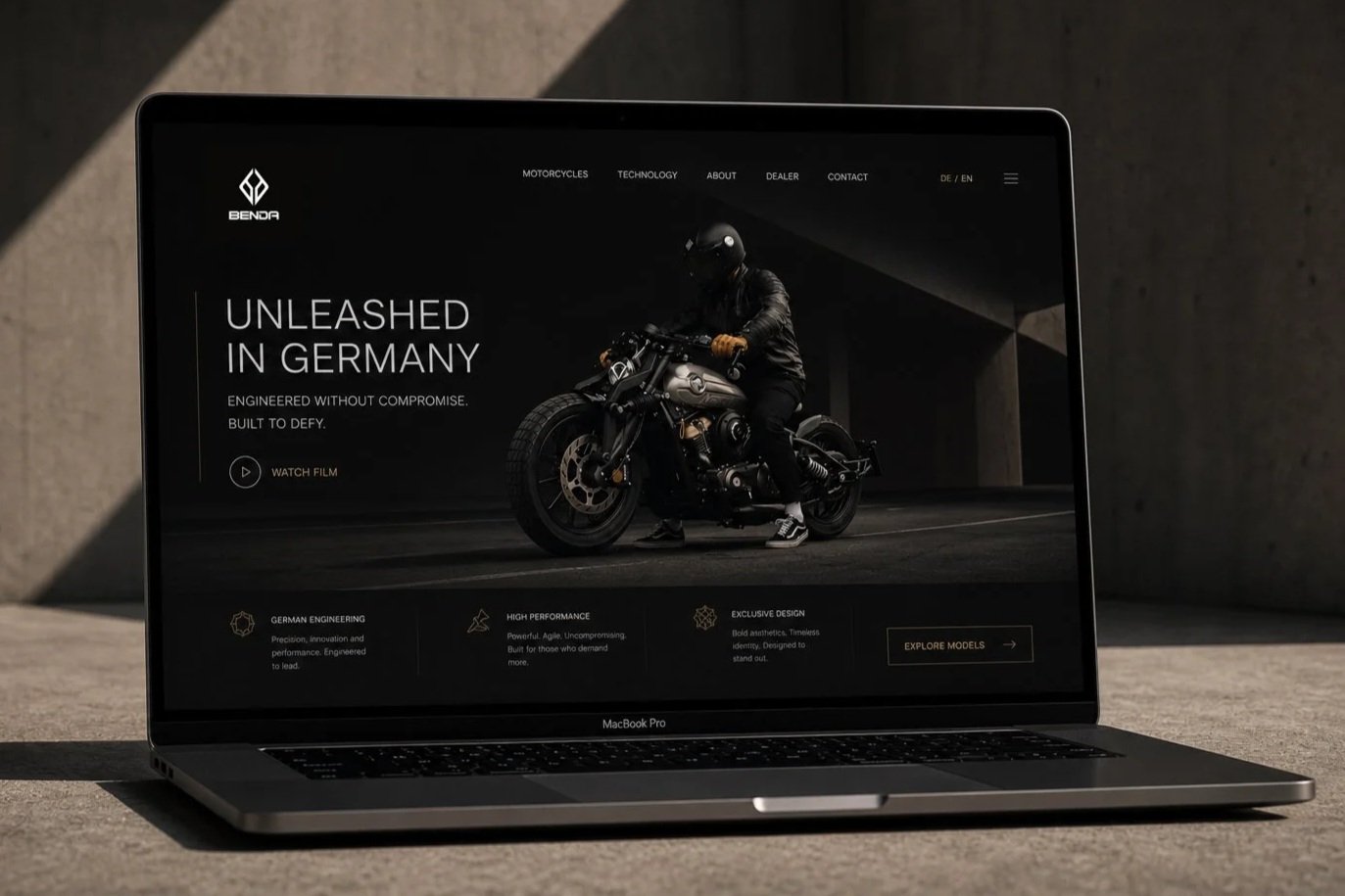
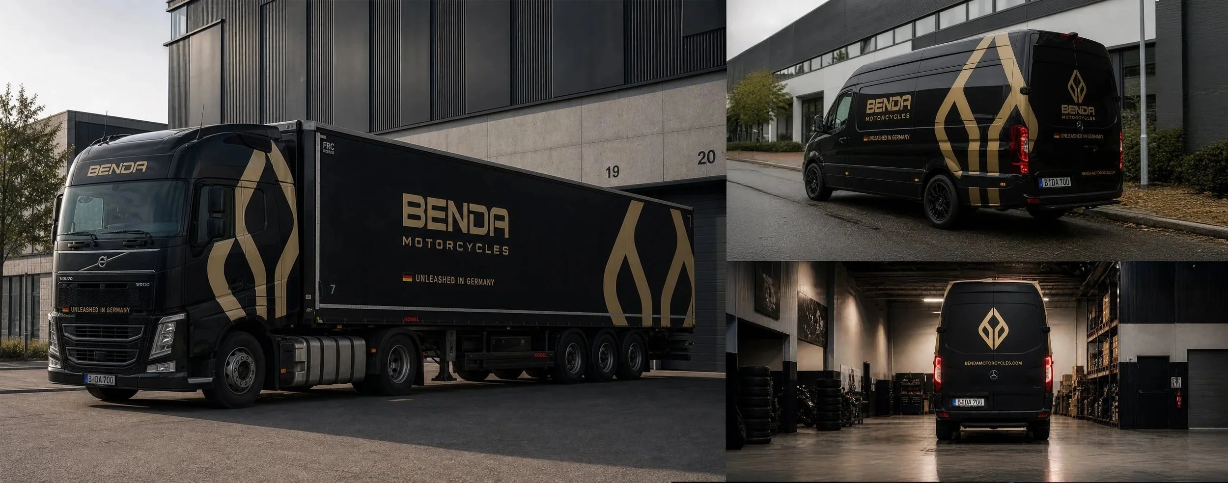
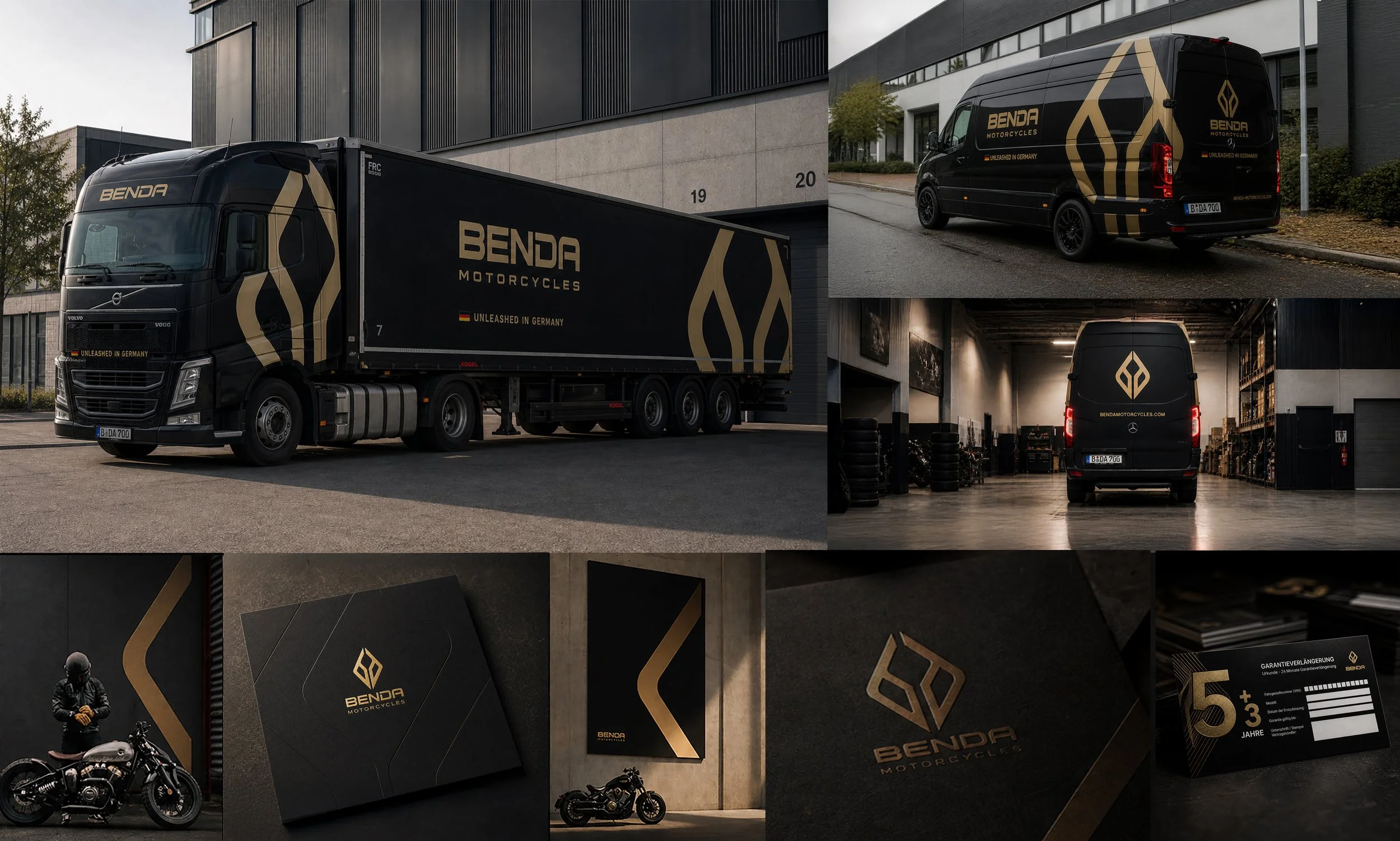
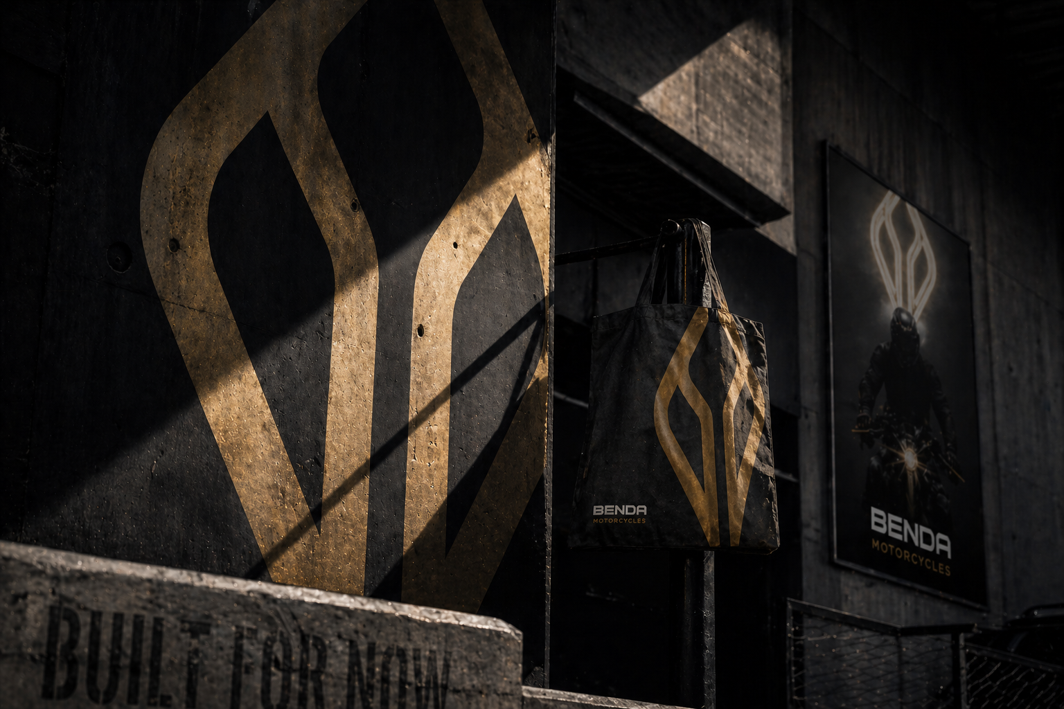
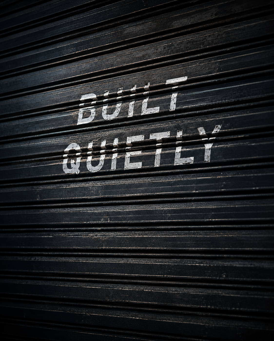
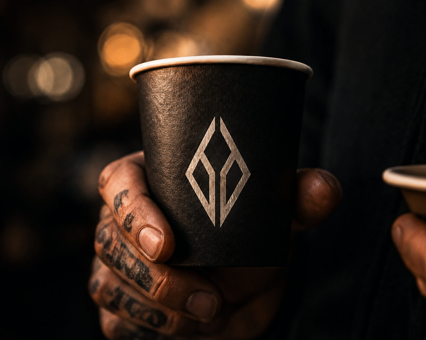
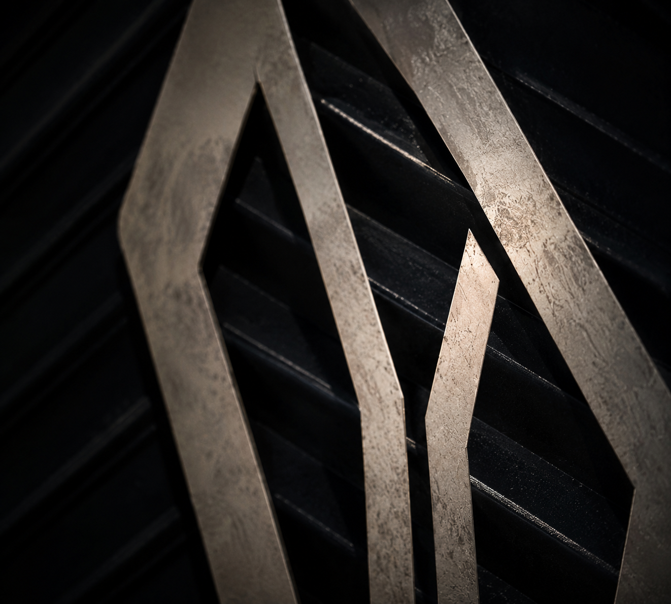
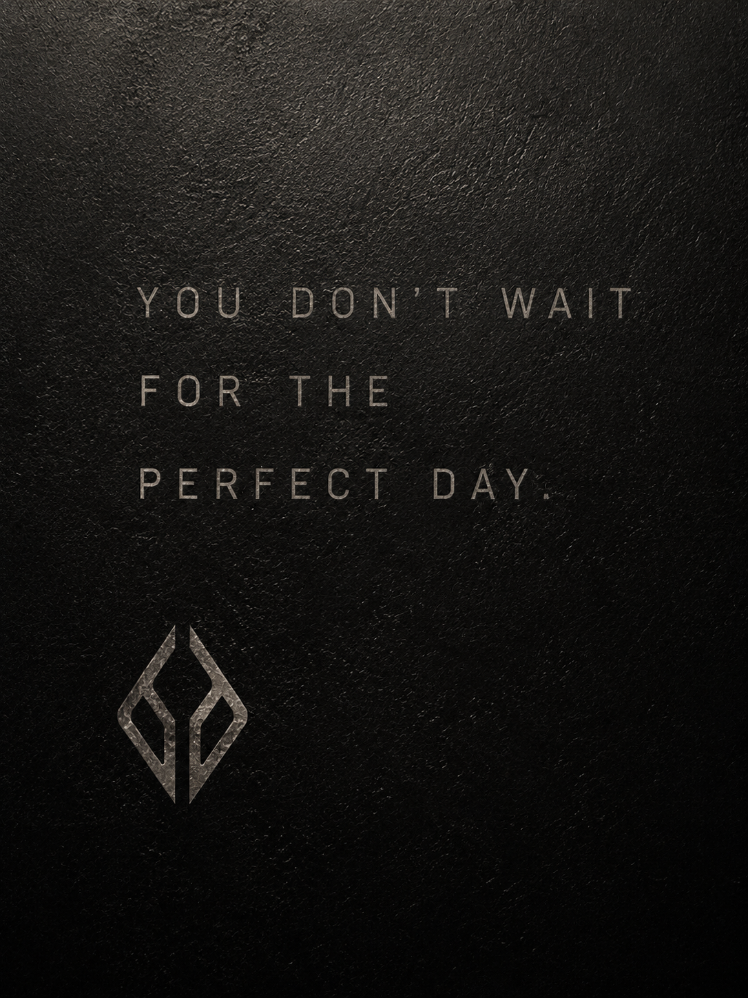
A premium visual system inspired by industrial elegance, motorcycle culture, and cinematic realism.
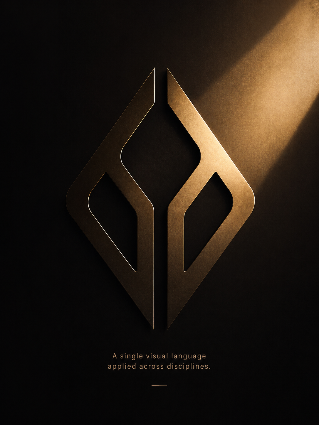
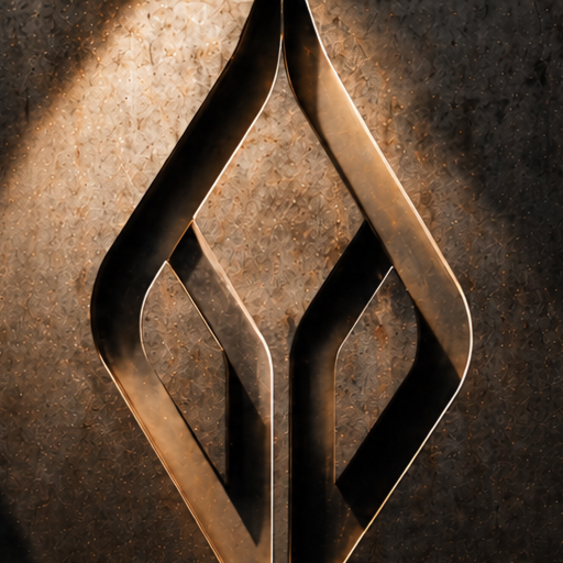
Deriving from real world elements like countours of the motorcycles and it’s symbol the visual identity becomes consistent and purposeful increasing brand memorability.
Built around four principles:
DISTINCTIVE
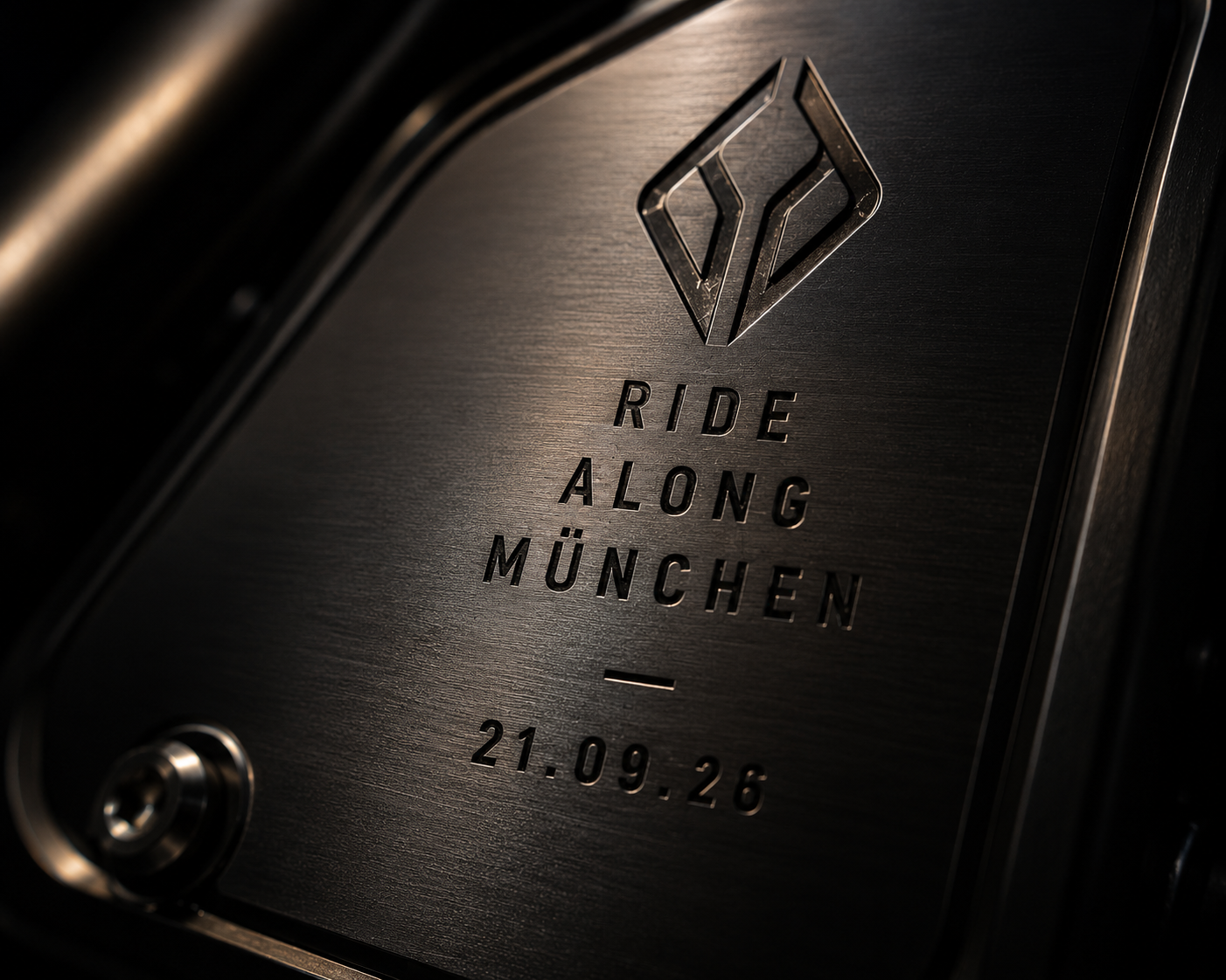
Recognizable at any touchpoint.
PREMIUM
Elevated beyond traditional motorcycle communication.
CULTURAL
Connected to lifestyle, fashion and design.
CONSISTENT
A scalable visual language across markets.
Creative Direction, Photography, Motion Graphics, Social Content & Brand Communication
P R O C E S S
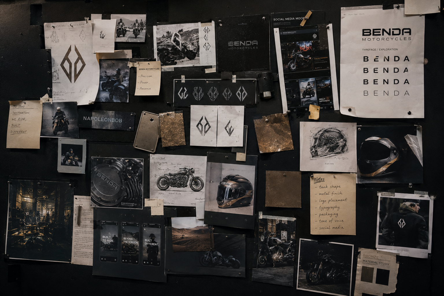
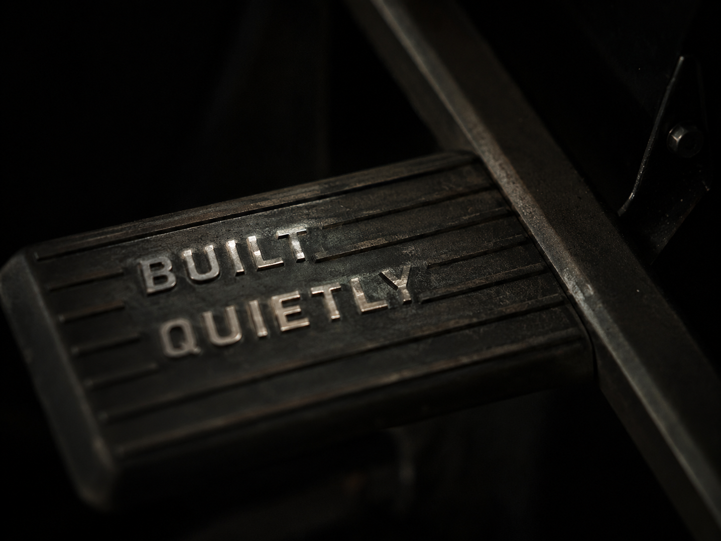
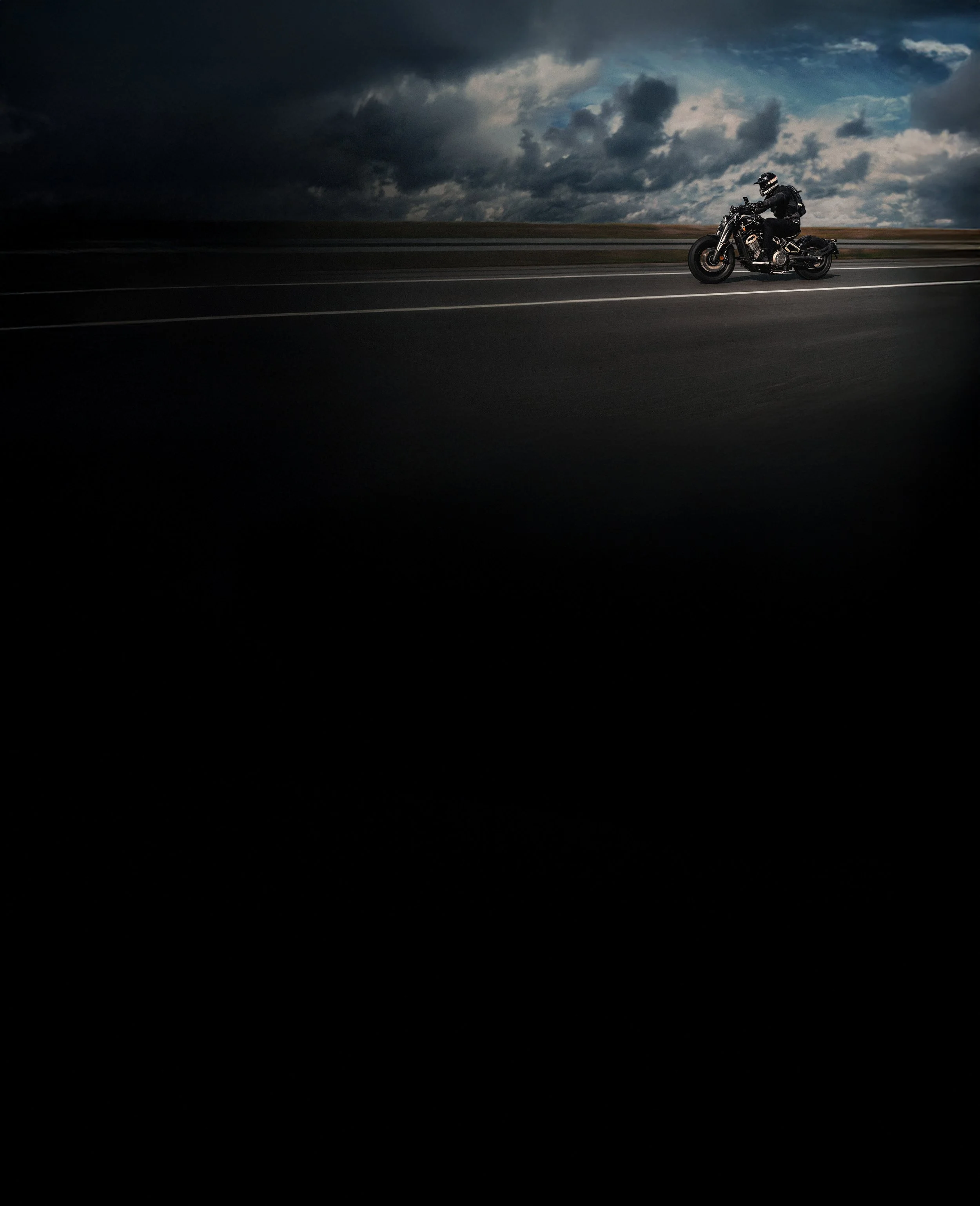
forged by form.
V I S U A L S Y S T E M
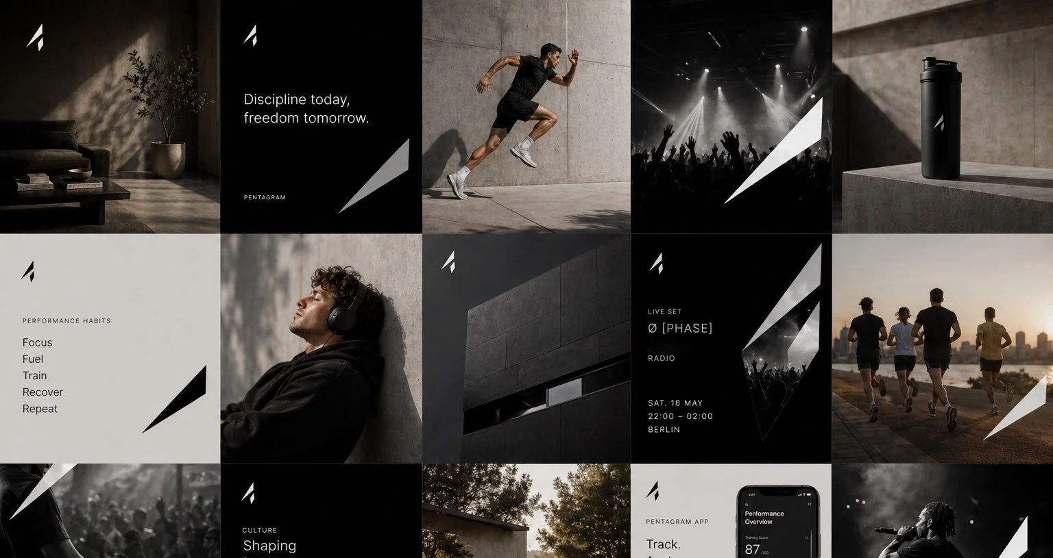
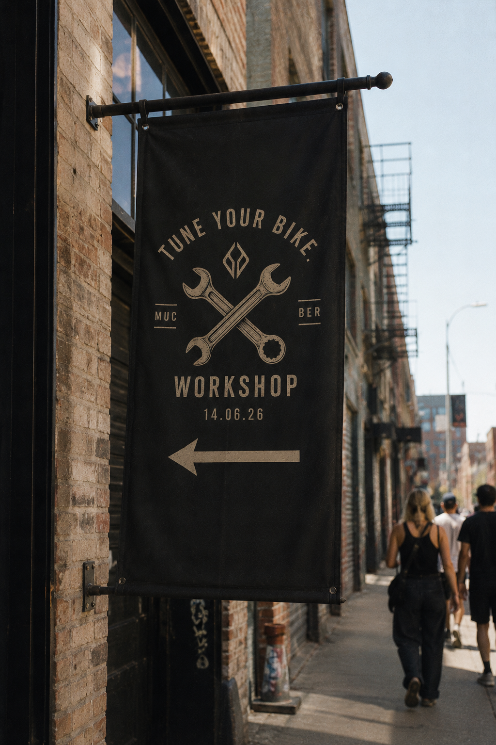
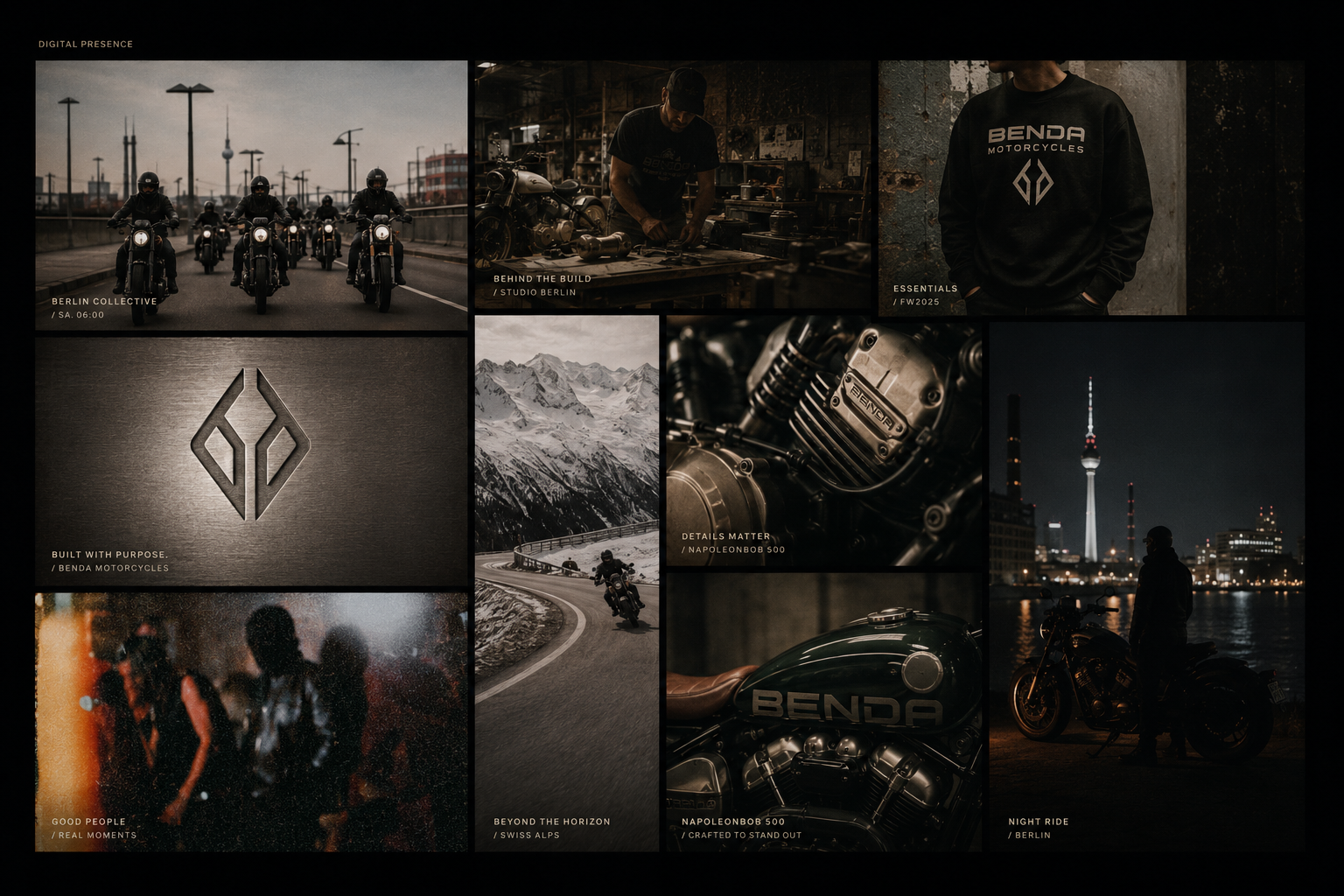
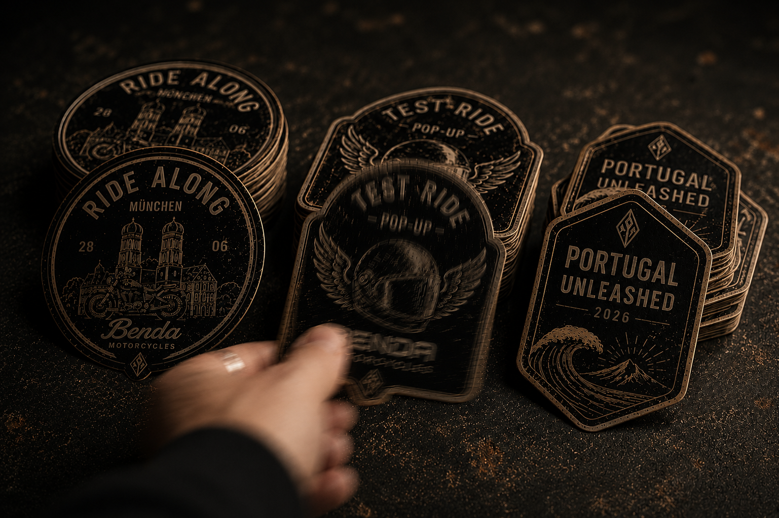
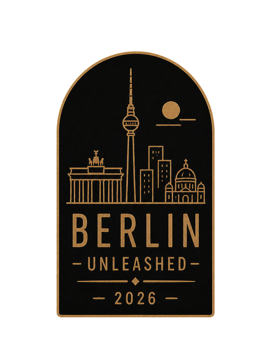
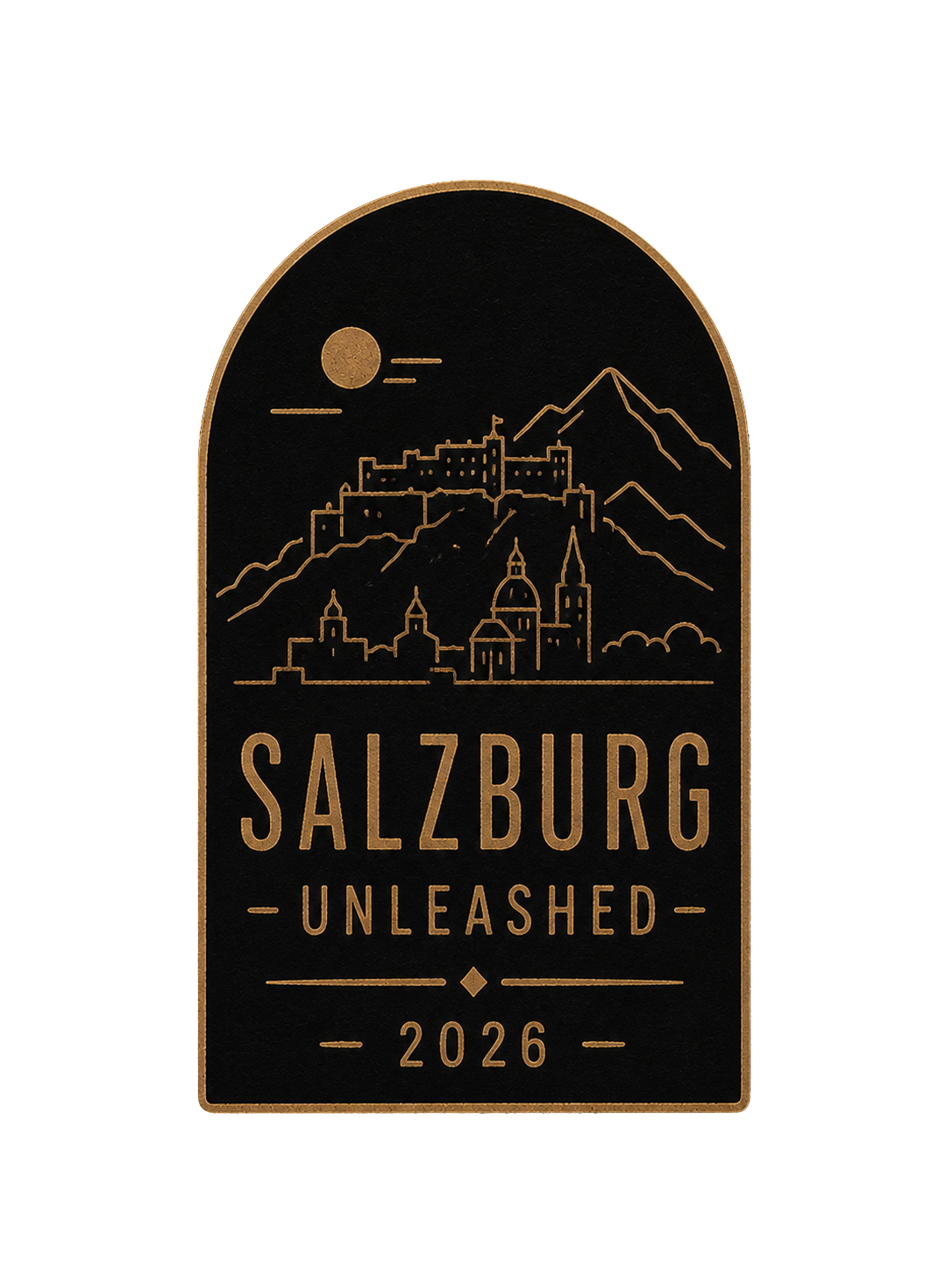
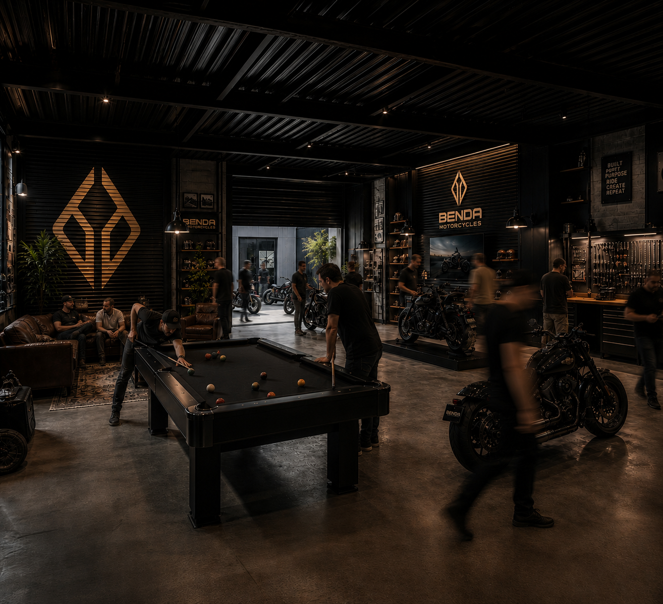
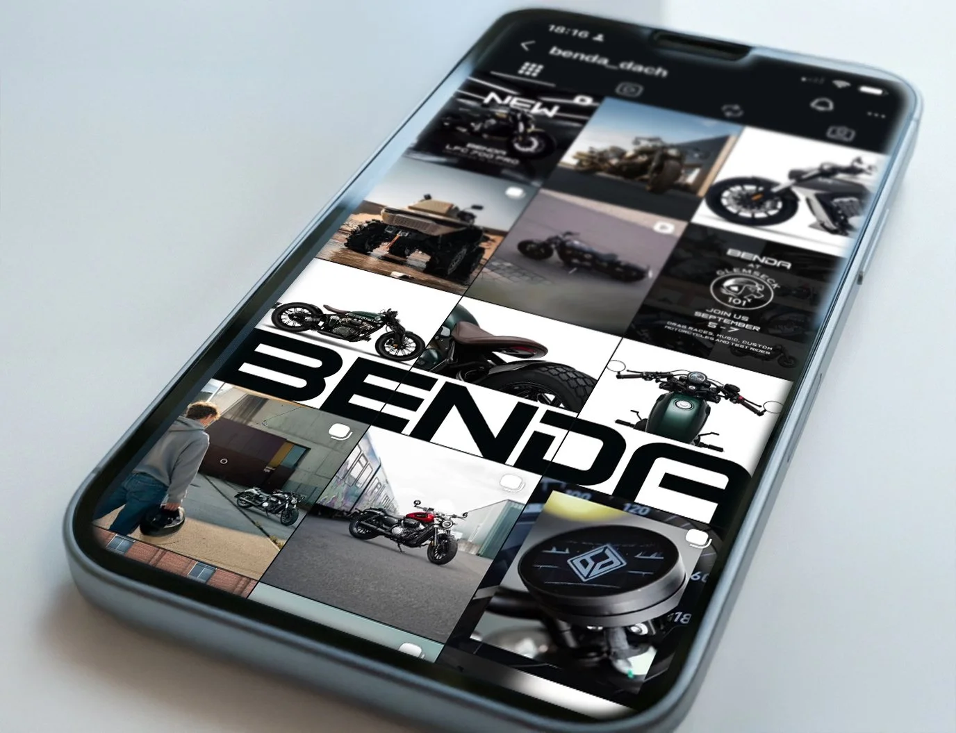
CONTENT AS A SYSTEM
Instead of isolated posts, content was approached as a connected ecosystem balancing product storytelling, culture and brand recognition.
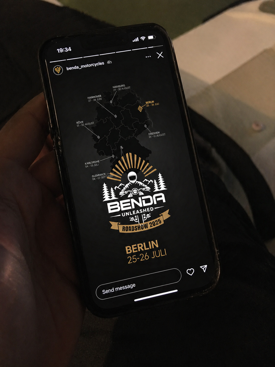
MOTION AS BRAND BEHAVIOR
Motion graphics were used to extend the identity beyond static imagery and create a more recognizable experience across launches, social content and campaigns.
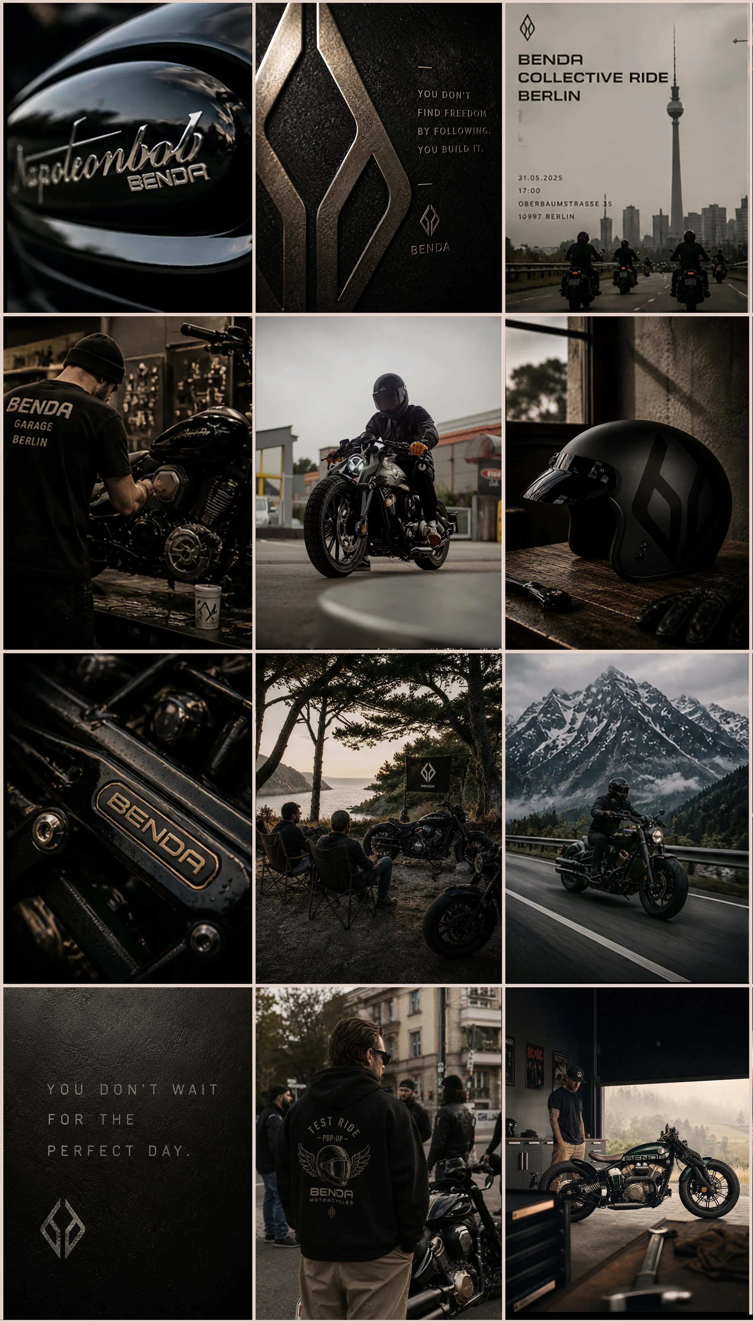
Designed as a scalable content system balancing product storytelling, lifestyle culture and brand recognition.
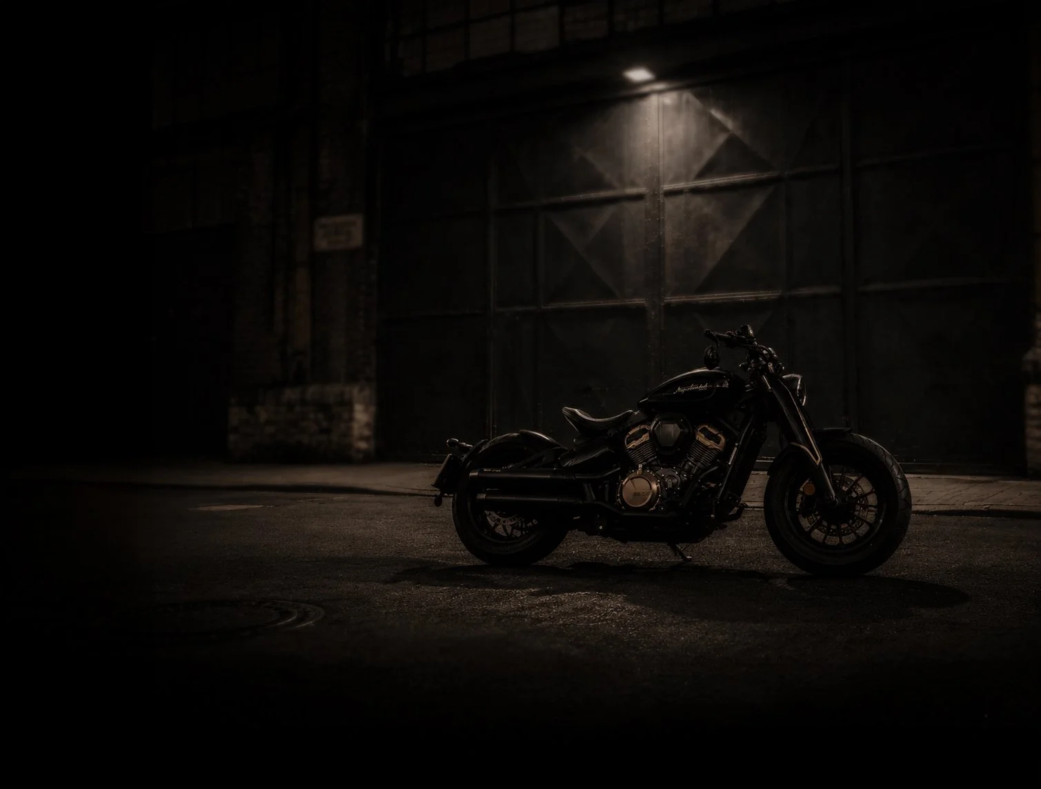
MACHINES WITH PRESENCE


more work
-
![]()
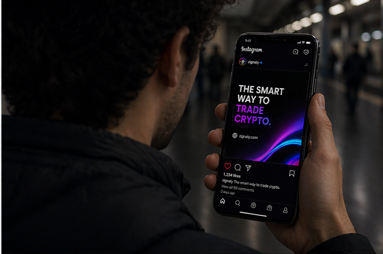
Zignaly
-
![]()
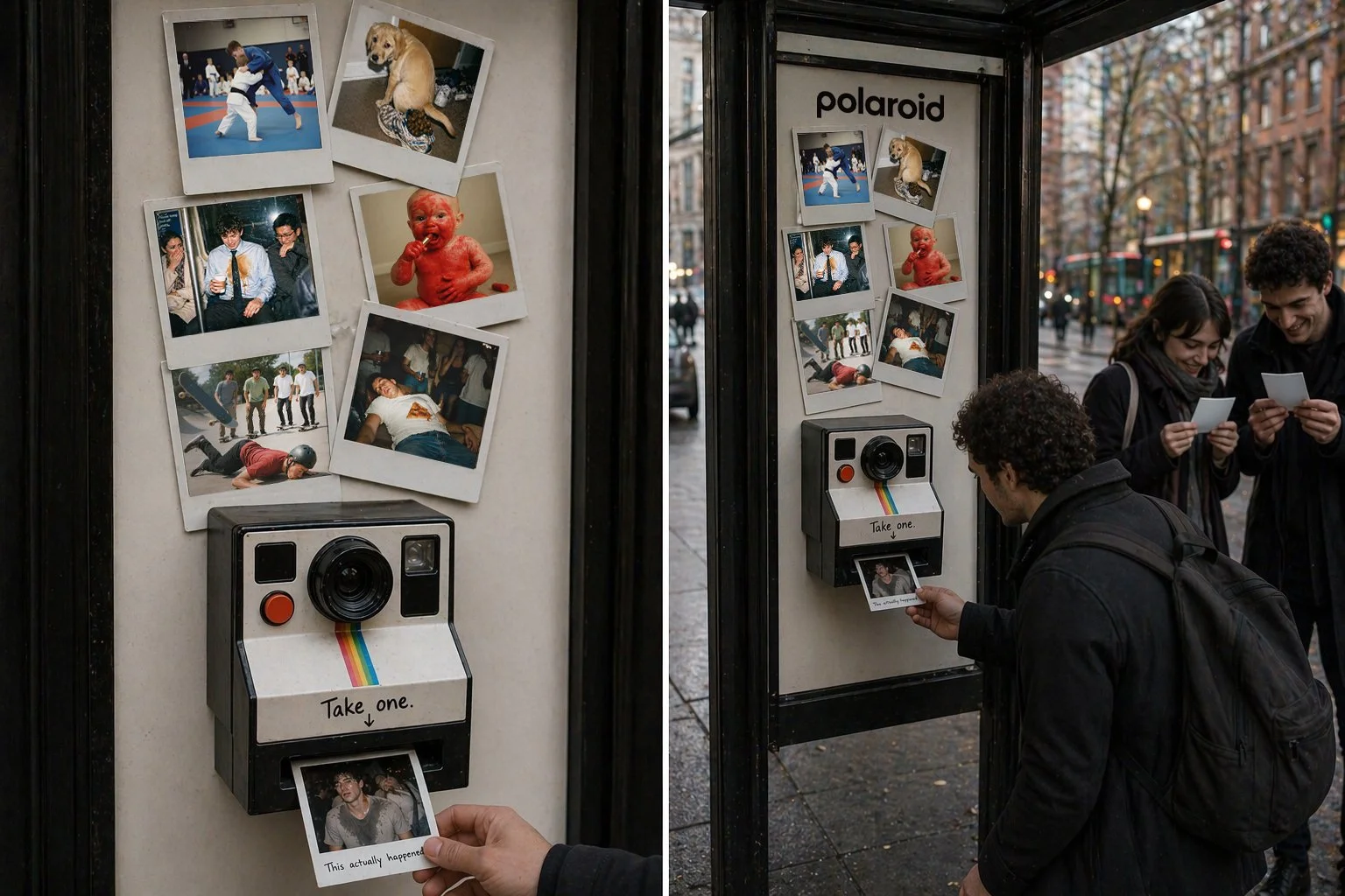
Polaroid
-
![]()
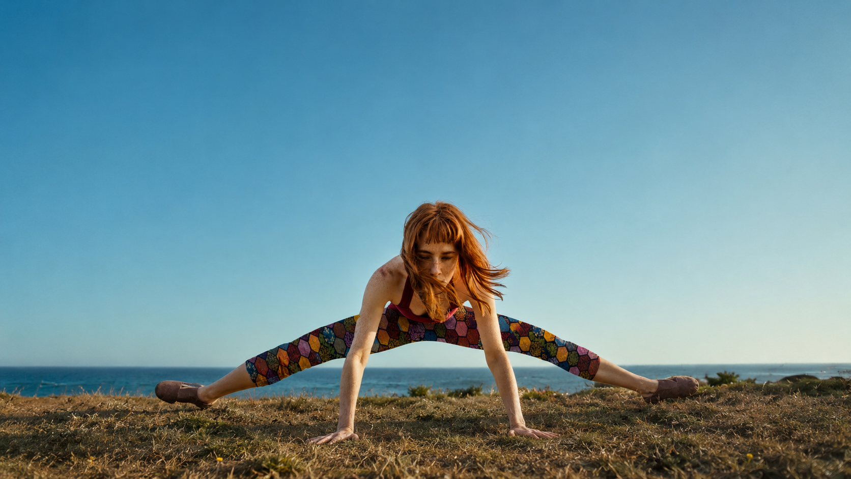
Niddra
-
![]()
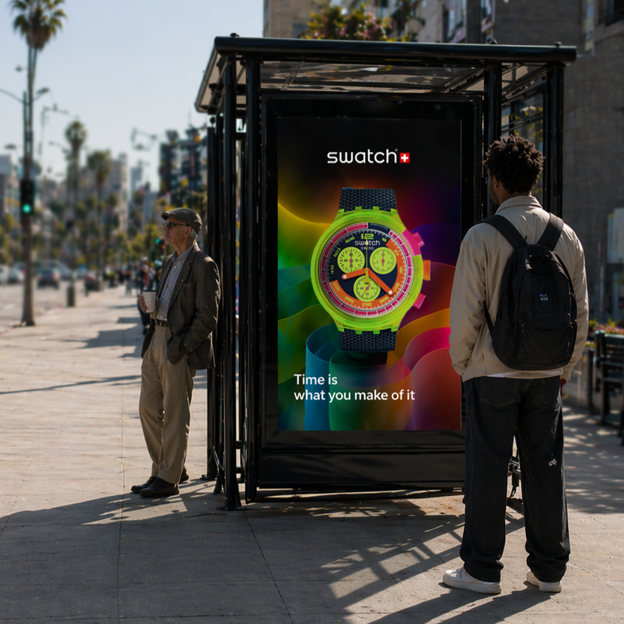
SWATCH
-
![]()
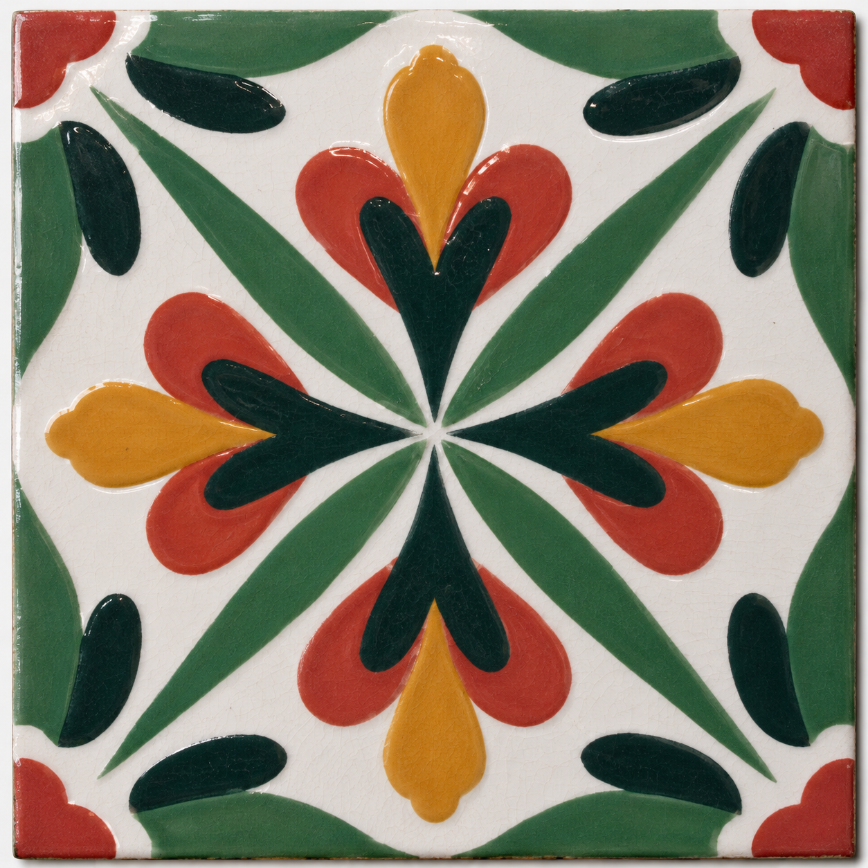
azulejo
-
![]()
PHOTOS
-
![]()
prisma
-
![]()
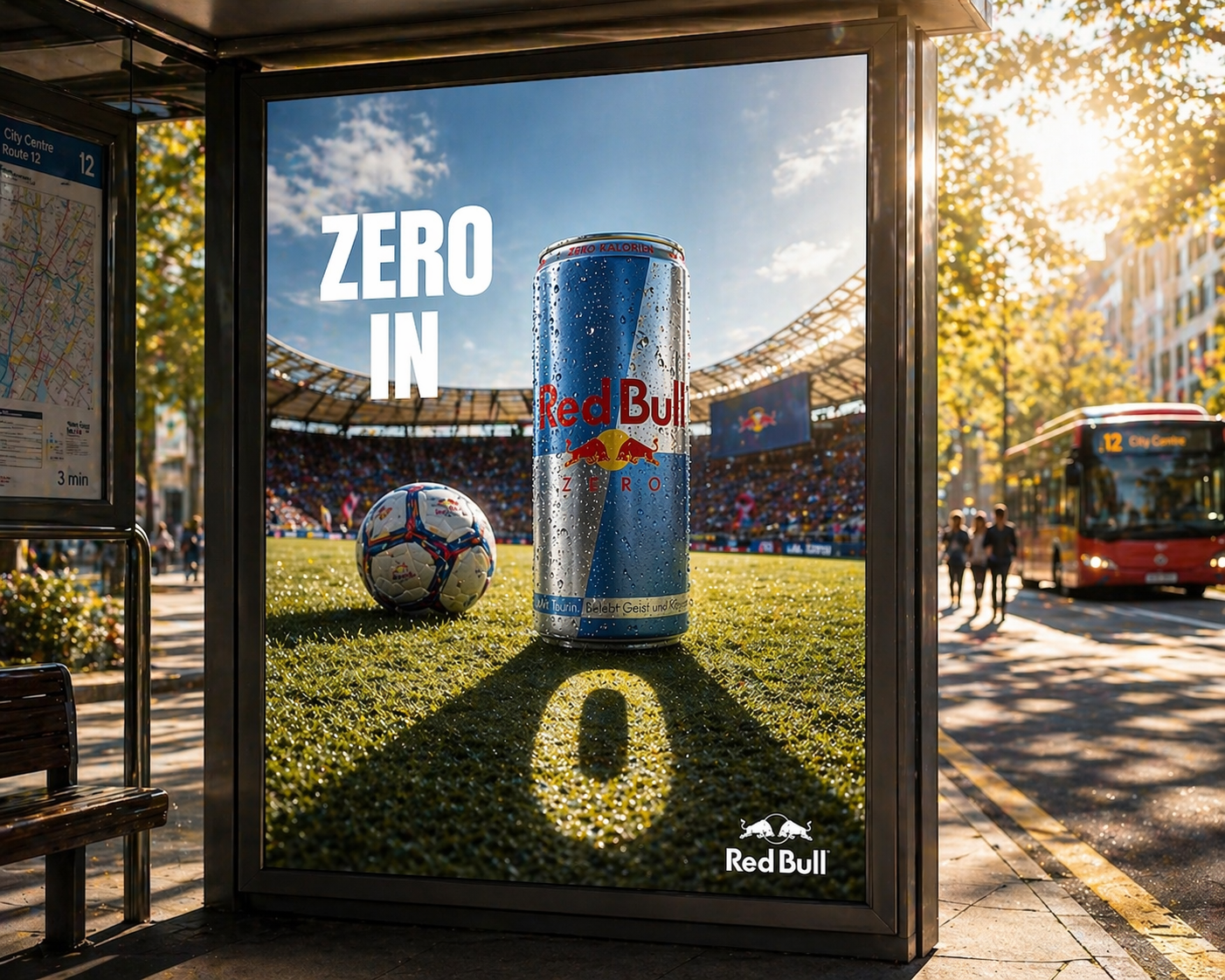
RED BULL ZERO
-
![]()
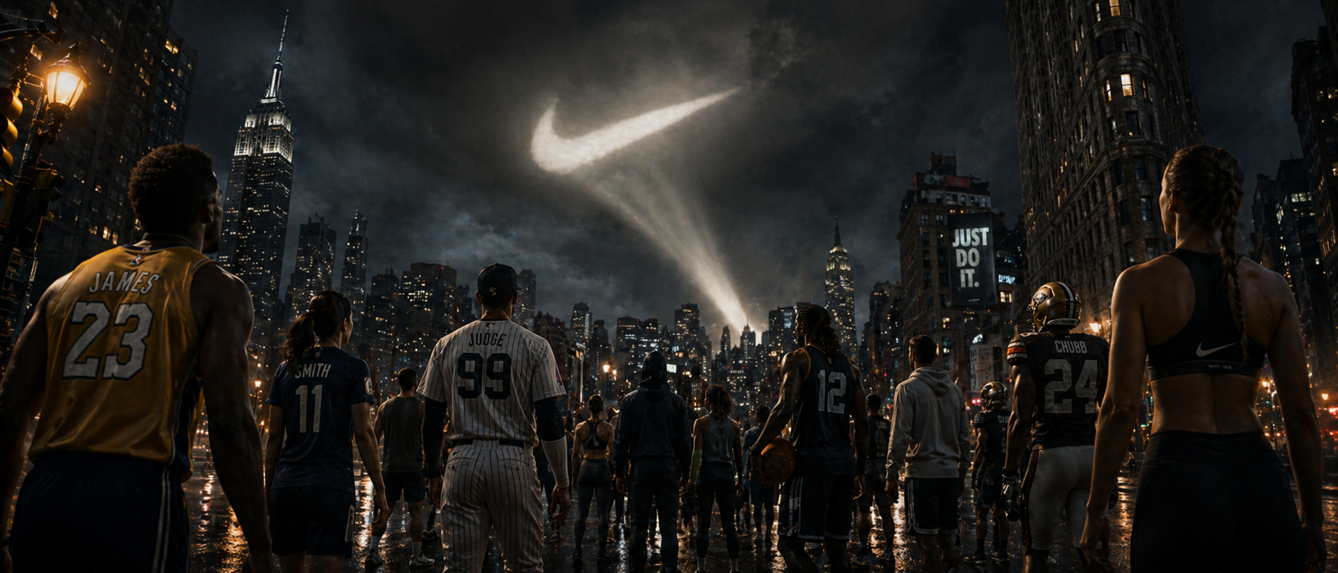
nike
-
![]()
lotus films